Project overview
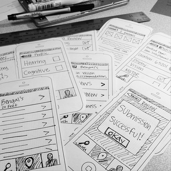
Compeer is an iPhone app that uses crowd-sourced reviews to rate the ADA-friendliness of buildings in Columbia, Mo.
Reviews are divided into four categories: cognitive, hearing, motor or vision. The user can customize which category reviews are displayed, tailoring the interface to their needs.
My role was conceptualization of the app, information hierarchy and systems-level design of all assets.
How people use it
-
Search for Reviews
Adam is planning a graduation dinner and wants to know if Restaurant A has braille menus. He opens up Compeer and searches for it. If any user reviews exist, he can read them.
-
Submit a Review
Kara knows how tricky Building B is to navigate. She decides to submit a written review describing the accessibility of the building, in hopes that someone else with a visual impairment might have an easier time getting around.
-
Self-Evaluation of Compliancy
Chris just installed new ramps for his new business and is wondering whether or not it's effective. Cool, people are loving it and his business is booming!
Nitty gritty details
Because it's an app for people with disabilities, I had to keep in mind the needs of the user. Minimal design barriers were imperative.
For example, the touch area is larger than usual and navigation is always a single tap. A high color contrast ratio ensures that users with vision impairments are able to consume information—color isn't a primary category indicator.
With the release of iOS 7 and introduction of dynamic type, I had the opportunity to rethink the typography and craft a harmonious scale. Fifty-six styles of harmony, to be exact.